Blog

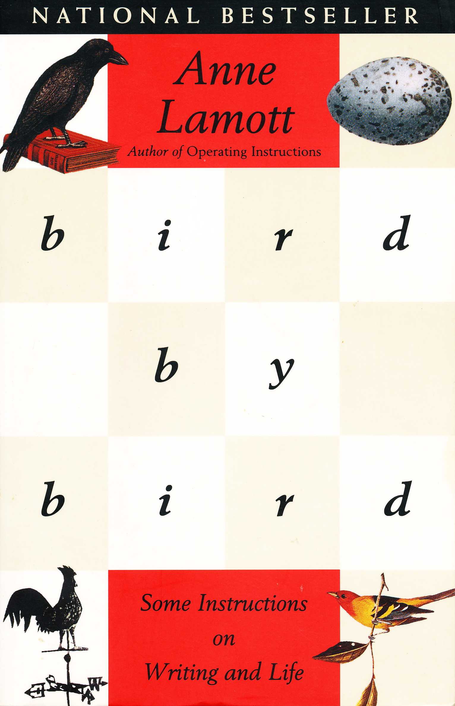
Book Notes: 'Bird by Bird' by Anne Lamott

I'm going to attempt, for a little while anyway, to make public some of my notes from some of the books that I've read. This is partly because people are forever asking what I'm reading, but it's mostly as a way to try and encourage myself to read both more deeply and more frequently -- a target I have been trying, and failing, to hit for all my adult life.

All projects and hobbies of mine eventually die from lack of attention if they cannot serve multiple purposes. So it is my hope that these notes will add even more reason to engage more frequently with long-form writing.

These won't be reviews, they really will just be some sections of the book with a line or two on why I highlighted them. But I hope that they can give you a good idea of if a book might or might not be for you, and if you should read it yourself. Many non-fiction books can be summarized with a few lines, but Bird by Bird captures, for me, why it still often feels necessary to read the entire thing and why you may want to as well even after reading my notes:

There may be a flickering moment of insight in a one-liner, in a sound bite, but everyday meat-and-potato truth is beyond our ability to capture in a few words. But the whole piece is the truth, not just oust one shining epigrammatic moment in it.

I often decide to pick up a book when I hear about it from too many different kinds of people. So it went with Bird by Bird which I'd been recommended not just by writers but also by many people with entirely un-writerly lives.

The Big Idea

When discussing the weekly column that Lamott wrote she said of the moment she sat down at her desk to actually write something:

Even after I'd been doing this for years, panic would set in.

As a person who makes semi-regular things, it's relieving to hear others express the same thought. After every, single, video I think: “I’ll never be able to do that again”.

The idea of the shitty first draft is that you shouldn't expect the first iteration of anything you do to be good. It's not supposed to be good: it's just supposed to be started.

All I had to do was to write a really shitty first draft of, say, the opening paragraph. And no one was going to see it. So I'd start writing without reining myself in. It was almost just typing, just making my fingers move. And the writing would be terrible.

Almost all good writing begins with terrible first efforts. You need to start somewhere. Start by getting something — anything — down on paper. A friend of mine says that the first draft is the down draft — you just get it down. The second draft is the up draft — you fix it up .

Also, trying to fix the unpleasant feeling of creative work is pointless. It’s always unpleasant. That’s just what creation is.

I know some very great writers, writers you love who write beautifully and have made a great deal of money, and not one of them sits down routinely feeling wildly enthusiastic and confident. Not one of them writes elegant first drafts… Very few writers really know what they are doing until they've done it. Nor do they go about their business feeling dewy and thrilled.

Pink Highlights

Pink highlights are reserved for particularly striking or important passages. I found them in the section on writers' 'block':

The word block suggests that you are constipated or stuck, when the truth is that you're empty.

'Downtime' is less downtime than filling-up time. But just because you are empty doesn't mean you are off the hook. Empty isn't an excuse to stop working: it's a warning to just have your non-zero work day and go fill up with learning or experiences.

But if you accept the reality that you have been given that you are not in a productive creative period you free yourself to begin filling up again. I encourage my students at times like these to get one page of anything written, three hundred words of memories or dreams or stream of consciousness on how much they hate writing just for the hell of it, just to keep their fingers from becoming too arthritic, just because they have made a commitment to try to write three hundred words every day. Then, on bad days and weeks, let it go at that.

Actionable Items

Twice Lamott pushes the point of why reaching out to other people while in the stages of your own work is beneficial thing to do:

The truth is that there are simply going to be times when you can't go forward in your work until you find out something… So figure out who would have this information and give that person a call… And it may also turn out that in searching for this one bit of information, something else will turn up that you absolutely could not have known would be out there waiting for you.

By far and away, this is the thing that I have the most problem with:

But by all means let someone else take a look at your work. It's too hard always to have to be the executioner. Also, you may not be able to see the problems.

On rare, rare occasions I’ve asked for feedback on scripts that I’m either particularly uncertain about or that have had unusually tight deadlines. The result is always better than before. But I don’t like the imposition that it causes — even though those same people have, on occasion, asked me to look at their own things and I am always happy to.

Other Notes

On inspiration:

And… you're off and running. And it really is like running. It always reminds me of the last lines of Rabbit, Run: "his heels hitting heavily on the pavement at first but with an effortless gathering out of a kind of sweet panic growing lighter and quicker and quieter, he runs. Ah: runs. Runs." I wish I felt that kind of inspiration more often. I almost never do. All I know is that if I sit there long enough, something will happen. My students stare at me for a moment. "How do we find an agent?” they ask.

On not listening to the radio station in your head:

If you are not careful, station KFIKD will play in your head twenty-four hours a day, nonstop, in stereo. Out of the right speaker in your inner ear will come the endless stream of self-aggrandizement, the recitation of one's specialness, of how much more open and gifted and brilliant and knowing and misunderstood and humble one is. Out of the left speaker will be the rap songs of self-loathing, the lists of all the things one doesn't do well, of all the mistakes one has made today and over an entire lifetime, the doubt, the assertion that everything that one touches turns to shit.

On taking notes:

Hostile, aggressive students insist on asking what I do with all my index cards. And all I can say is that I have them, I took notes on them, and the act of having written something down gives me a fifty-fifty shot at having it filed away now in my memory.

As a man with, at the time of writing, 2,353 notes in Evernote this is a bit of a relief.

You can get a copy of Bird by Bird at Amazon.com


Dark Mode as iOS Accessibility Feature

With iOS 7, everything went white.  White backgrounds with black text is omnipresent in not just the default apps but increasingly every third-party app is joining the party:


Translation: don’t ever use this app in bed at night.

Translation: don’t ever use this app in bed at night.


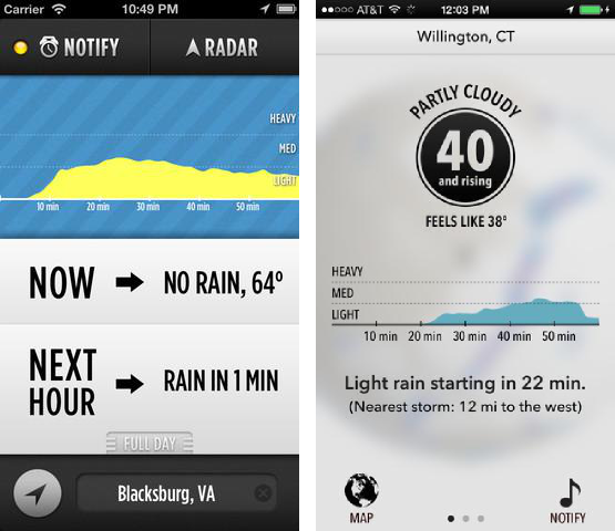
In general I’m in favor of the redesign, though there have been examples of apps tragically losing all their personality:

 
 I still cherish you, Dark Sky, but you're not the same app I fell in love with all those years ago.

 I still cherish you, Dark Sky, but you're not the same app I fell in love with all those years ago.


With each point release of iOS 7 and each beta release of iOS 8, I hoped Apple would craft a black-mirror view of their white world.

I hoped in vain, for a system-wide dark mode.  Where the white background could go dark and the dark texts could go light.  

But alas, now with the official release of iOS 8, there is no dark mode.  I hoped Apple would implement it because dark mode isn't just a feature for night time use.  For some of us dark mode is an accessibility feature.

Sacks of Fluid

Many years ago, on a sunny day, I looked at the bright blue sky and saw a small blurry spot on it that shifted with, but didn’t exactly follow, my vision.

Something was stuck.  On my eye.

I tried to rinse it off myself, but to no avail.  One, slightly panicked, trip to the the eye doctor later and I learned the spot wasn't on my eye but inside my eye.

My first floater had arrived.

Floaters are, among the list of all the things that can go wrong with your vision, pretty minor.  They are nothing compared to the creeping, maddening, horror of macular degeneration.

That said… floaters are still really annoying.

The fluid in your eye congeals a bit, or flecks of the interior wall of your eye break off -- these  solid pieces then float lazily around the interior of your eyes.  Impossible to focus on, yet still getting in the way of your vision.

Many people eventually develop one or two but, if you're unlucky, their number continues to increase until there are always many in your field of vision.  Just how annoying this is is difficult to convey. They follow what you look at but not quite so it is impossible for your brain to learn to photoshop them out. They drift around never quite in the same spot and, given their lightness and the viscousness of your eyeball fluid, difficult to make go away.

As a result – I’ve developed a bit of a tic that I try to conceal when talking to people, – if a floater is too directly in the field of vision I’ll look up and down in quick succession – trying to stir the snow globe of my eyes into a less frustrating pattern.

Back to iOS

Floaters are most visible on a bright white background when trying to discern thin dark shapes.

This is reading.  For someone with a lot of floaters, it always looks something like this.


My animation and GIFification skills are inadequate, but this should give you some sense of what reading with floaters is like.  The true effect is impossible to recreate because it's different for each eye and tracks your focus.

My animation and GIFification skills are inadequate, but this should give you some sense of what reading with floaters is like.  The true effect is impossible to recreate because it's different for each eye and tracks your focus.


Now you may see why, the design aesthetic of iOS 7/8 is problematic.  Black text on a white background is everywhere.  

Dark modes, where the background is dark and the text light greatly reduces this problem and apps like Instapaper and Editorial get super-bonus points because in addition to black-on-white, which is still high contrast, they also have a low contrast off-white text on dark gray or blue background.  This low contrast mode all but makes the problem disappear.  

Instapaper black: so much more readable. 

Instapaper gray: just about perfection.  I'm a normal reader again.

Editorial: where I spend most of my working life.  It's the world's most feature-packed iOS writing app.   I use it solely because on iPad the background is dark blue.

But! But! Invert Colors Mode!

Invariably when an iOS dark mode is brought up people point out that Apple already (sort of) has this: inverted color mode. Yes, without a doubt inverted colors help, and yes, I’ve mapped invert colors to the trip click of my home button.

But it’s not really a solution, it’s a hack with downsides.

Here’s why inverted colors isn’t a solution:

1) All photos and images are useless.


What's wrong with your face?


2) Color meaning is lost.

Many apps pick opposite colors (green & red, orange & blue) to highlight important, meaningful parts of their interface.  While this make it easy to quickly spot important information.  Therefore, inverting colors also inverts the meaning of many interface elements.  

For example, Mail.app uses orange for flagged messages and blue for unread.  


Now here’s the app with inverted colors:

 
Wait, what?

Wait, what?


Inverting the colors also changes the tone interface elements to the opposite of what their designers intended.  Take OmniFocus for the iPhone:


Not that I look at this text-heavy screen too much anyway.  It's just the command center for my entire life.  

Not that I look at this text-heavy screen too much anyway.  It's just the command center for my entire life.  


Freak-out colors (red, orange) are used for overdue and flagged, and chill-out colors (blue, green) for the rest. Invert colors makes the less important parts of the screen pop more and subdues the parts that are supposed to draw your attention.

3) Dark Mode Must Be Constantly Turned On and Off

Because of the above problems, and because some apps do have their own dark mode while others don't, invert colors needs to be turned on and off constantly.  The invert colors setting lives in: 

Settings -> General -> Accessibility -> Invert colors

Given that placement, we must thank the Gods of Apple it's possible to set a triple click of the home button to invert the colors.  

However...

Even with that shortcut it's still a seven-click/tap process to switch from an app in inverted color mode to another app that isn't.  (double click home, swipe to app, tap app, triple click home to invert) Sure, it’s no Endorian Holocaust, but it's a theoretically avoidable annoyance piled on top of an unfixable frustration.

TL;DR

I'm still holding out hope for Apple to, one day, introduce a true system-wide dark mode for iOS that apps can opt into participating with their defaults.  (Apple already has done this with OS X, sort of.)

But until that day comes, I ask developers of text-heavy apps: please consider including a dark mode for your app not just because it's a night-use feature but also because, for some of us, it's an accessibility feature.  

Faceless Voices

For the last decade of his life, my grandfather lived in a world of faceless voices.

His vision lost, he listened to the audiobooks and radio dramas my father brought him: westerns and space operas and stories that, as a child, I would never have spontaneously picked up. But the drive to my grandfather's was long and the tapes already with us, so my father put them on and created for me a childhood filled with the spoken word.

The habit formed, in high school and college I borrowed audiobooks from the library in their large, clunky plastic cases of CDs. At the start of my adult life I had a digital music player in my pocket filled with audiobooks and then-new podcasts.

My flatmate at the time had never met anyone who so constantly listened to 'radio'. Years later she has acclimated (mostly) to the sight of her husband, always around the home with one earbud in, listening to others.

My audio world is largely one of faceless voices. Though unlike my grandfather this is by choice, rather than forced by a failure of biology. What the owners of many of the voices I listen to look like I don't know, and I don't want to know.

The spoken word combines the expansive possibility of writing with the exactingness of visual media. An audiobook narrator can give the text a depth the words alone could never convey. An author reading his work can shift his tone or emphasis to draw attention to particular words far, far more than italics ever could.

The right voice with the right story expands the inner eye to its widest.

But this inner eye is a delicate thing -- a palace of glass seen brightly, if ethereally. Discovering the face of a voice is not an addition, but a subtraction. The face becomes the voice in the way an actor becomes the character they play from a book.

This feeling can be so strong that I suspect the brain treats voices from unknown faces differently than faced voices. That under the scrutiny of an fMRI we could see that while listening to an unfaced voice the visual cortex is still -- allowing the inner eye to see, but a voice with a known face stirs the visual cortex disrupting the imagination.

No longer is there a shifting palace of glass in the mind -- the real vision, too clear, too precise replaces it. An inert, opaque blueprint. The inner eye, forevermore, blind in that direction.